can anyone recreate these conion labels.
- Thread starter ConionXX2
- Start date
You are using an out of date browser. It may not display this or other websites correctly.
You should upgrade or use an alternative browser.
You should upgrade or use an alternative browser.
- Status
- Not open for further replies.

mmcodomino
Member (SA)
Zippy said:Not bad Max
You should try optical instead of metric kerning though, will make the text look a lot better!
And maybe the text should be rendered a little softer.
No offense...but you're talking Chinese to me

What I posted is only a crappy screen shot. The original file is an ODP (ppt wanna be)
Will finish the rough version today.
")
Zippy
Member (SA)
http://de.wikipedia.org/wiki/Unterschne ... Typografie)
And for the text rendering, you can see the pixel stairs wherever the letters are supposed to be round. Though that might not be the case when printed.
You should really be using something like Photoshop...
And for the text rendering, you can see the pixel stairs wherever the letters are supposed to be round. Though that might not be the case when printed.
You should really be using something like Photoshop...
mmcodomino
Member (SA)
Zippy said:http://de.wikipedia.org/wiki/Unterschneidung_(Typografie)
And for the text rendering, you can see the pixel stairs wherever the letters are supposed to be round. Though that might not be the case when printed.
You should really be using something like Photoshop...
 I would love to use Photoshop but am liek a dollar short for the license
 ") . Damn, I even don't use Powerpoint but Open Office
. Damn, I even don't use Powerpoint but Open Office 
Anyway - when printed, this looks really good

Are you studying graphic design or why are you so educated about that subject?


mmcodomino
Member (SA)
The diameter of the circle is still a little too big but YOU KNOW YOU WANT IT!
Damn - this looks so good on the unit itself

Damn - this looks so good on the unit itself
baddboybill
Boomus Fidelis
mmcodomino
Member (SA)
baddboybill said:Max looks pretty gooddid you make it on paper or cardboard

This is still simple paper just to fit the dimensions accurately
.The real deal will be printed on glossy cardboard or at least high quality cardboard
The colors will look a lot brighter then
baddboybill
Boomus Fidelis
So Max you going to make the circle smaller as well. I would love to see the finished product on the cardboard stock
mmcodomino
Member (SA)
baddboybill said:So Max you going to make the circle smaller as well. I would love to see the finished product on the cardboard stock
Yes, the label is going to be printed on DIN-A3 paper so only the right small part of the yellow ribbon has to be glued on and the rest is in one piece
The longer I look at the circle, the more I doubt i should actually make it smaller but I am going to try that and compare
Clairtone version is ready too btw
kraftmatic
Member (SA)
mmcodomino
Member (SA)
kraftmatic said:Is this still in the works? Can't wait to see the final product.
Yup, I had some printed which looked really good but sadly the colors were off so I will have to give it another go
MrMcBlaster
Member (SA)
MrMcBlaster
Member (SA)
MrMcBlaster
Member (SA)
Any news on these labels??
There must be a whole bunch of us in dire need of these, even if they're not quite 100% factory copies they look mighty sweet and I'd be chuffed to have one on mine!
Has anybody made one yet? Plz tell me it's so....
There must be a whole bunch of us in dire need of these, even if they're not quite 100% factory copies they look mighty sweet and I'd be chuffed to have one on mine!
Has anybody made one yet? Plz tell me it's so....
caution
Member (SA)
Over three years of silence... hmm... I think we're on our own.
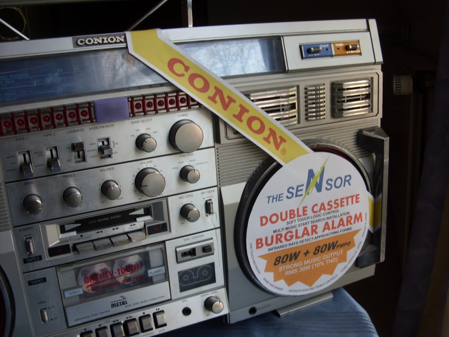
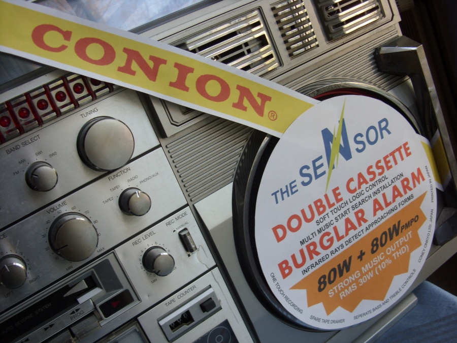
I don't see the original pics posted anymore, but from the pics I can find online his label is missing all the green graphics. The fonts are wrong too. Maybe I could try and recreate one, does anyone have a better pic?


I don't see the original pics posted anymore, but from the pics I can find online his label is missing all the green graphics. The fonts are wrong too. Maybe I could try and recreate one, does anyone have a better pic?
GHETTOBLASTER4LIFE
Member (SA)
- Status
- Not open for further replies.