The Next Part Of My 80s Style Advertising Odysseys
- Thread starter Gluecifer
- Start date
You are using an out of date browser. It may not display this or other websites correctly.
You should upgrade or use an alternative browser.
You should upgrade or use an alternative browser.
- Status
- Not open for further replies.
skippy1969
Boomus Fidelis


baddboybill
Boomus Fidelis


fresh produce
Member (SA)
Old school Scott
Member (SA)

im_alan_partridge
Member (SA)
Wow Glue, if somebody had posted this as a genuine old advert/poster they had found from the 80's i would not have doubted it for a second.
Great work mate.
Great work mate.
MONOLITHIC
No Longer Active
im_alan_partridge said:Wow Glue, if somebody had posted this as a genuine old advert/poster they had found from the 80's i would not have doubted it for a second.
Great work mate.
 200%!!!
Thanks guys!
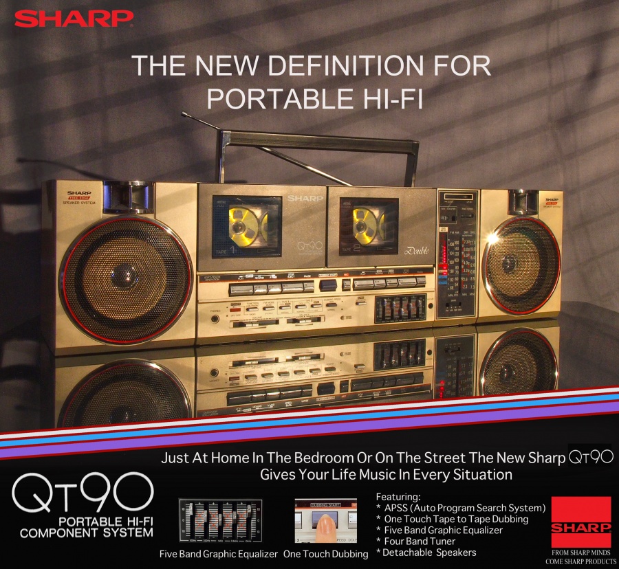
The shot of the QT90 is one of those HDR deallies, I think it's about six shots made into one, to get all the shadow depth while keeping the high lights.
Scotty: the Sharp tag line in the corner just scaled craply when I reduced the image size down, had to reduce it to 60% or so of the original size and then it's scaled further when it's displayed on here. Looks perfect on the 8meg original. If anyone would like full res copy for their collections or to print out I can up the full res one.
Rock On.
Hopefully this should work for the original size, if it doesn't come up full let me know and I can up it elsewhere
http://www.flickr.com/photos/p3ss3ssod/7392443210/sizes/k/in/photostream/
Rock On.
http://www.flickr.com/photos/p3ss3ssod/7392443210/sizes/k/in/photostream/
Rock On.
=ml=
Member (SA)
Nice work Glue! 
")
A few comments (I'm not an art director, but I play one on the interwebs") ):
):
* Handle might look better if it was straight up
* Love the synch'd tape reel positions
* Droopy antenna shadow is kinda odd
* Love the blinds/9 1/2 Weeks reference
* Some fonts don't seem "correct" (it was all Linotype and Letraset back then)
Go!
=ml=
A few comments (I'm not an art director, but I play one on the interwebs
):* Handle might look better if it was straight up
* Love the synch'd tape reel positions
* Droopy antenna shadow is kinda odd
* Love the blinds/9 1/2 Weeks reference
* Some fonts don't seem "correct" (it was all Linotype and Letraset back then)
Go!
=ml=
bklyn sound
Requiem Æternam
- Status
- Not open for further replies.